But wait, why would you want to do that? Isn’t a yearbook cover typically 8 ½ x 11 inches big?
Well… yes, but things are changing, the world has gone digital, and so has your yearbook. There are all kinds of new things to think about, like adding videos to your content, taking more pictures because digital allows for unlimited content, not worrying about creating layouts and… creating a yearbook cover in a new format.
The cover is a first impression, inviting the reader to delve further into the yearbook to explore a very important year. It sets the tone and as such it requires creativity and an understanding of the class it is representing.
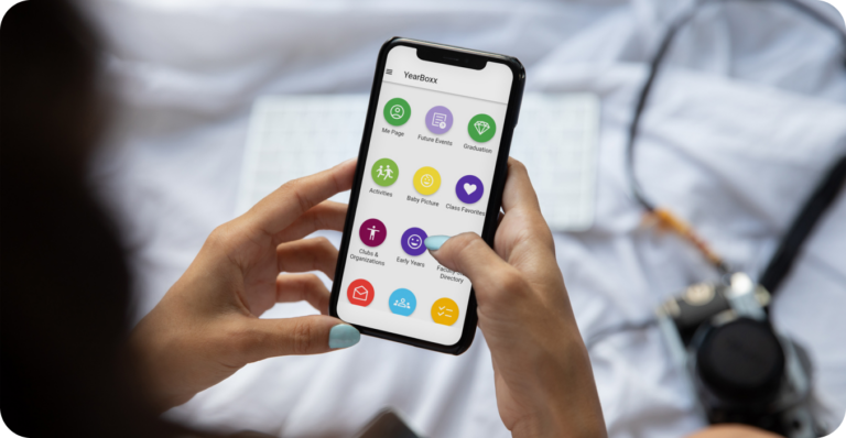
The cover of YearBoxx, the first true digital yearbook, is, understandably, the first thing viewers will see after selecting the YearBoxx icon. It will come up, stay for two seconds, then fade away to show the Table of Contents. It’s a cool transition.
There are a few things that need to be represented on the cover. Certainly, the name of the school AND the graduation year. Additionally, the address of the school may be helpful, and the theme would be appropriate.
The most important item on the cover is the image, so let’s take a dive into that. The options are limited only by imagination and we will discuss that in a moment. The mechanics of the image are basic, it must be vertical; the aspect ratio would be 19.4.
The image can be a photograph, art work, computer graphic or simply a color. The text would be overlaid on the image.
So, as you can see, actually creating the cover is quite simple. The more exciting aspect of building the cover is the creativity. This can be a daunting task because there are so many options. Some yearbook staffs use a particular image simply because it looks well. Sometimes they will create a cover that has special meaning to the graduating class.
Once you have come to terms with what format you would like to use, it is helpful to begin with a theme. A theme, in general, is about the journey the class has been on, it is about what this particular group of students feels, what they have experienced. The theme ties the cover design to the year’s events, milestones, and shared experiences. It may be helpful to Google yearbook themes if you are struggling. Easy to work with themes would be ideas like; A Journey Through Time, The Future is Now or Our story Unfolds. There may have been a local event that helps define the year or even a national event.
Choosing a color scheme is helpful. Color can evoke emotions, trigger important memories and please the eye. Bold and bright colors convey energy and fun, while pastel tones infer nostalgia and warmth. You may want to stick with school colors that can add a sense of school pride.
Incorporating school identity can be impactful. Consider adding to an image or even just a color background, the school logo or mascot, or the school’s motto. They can foster ownership as well as connection. Subtle patterns or watermarks featuring these symbols can be an effective way to integrate them into the design without overwhelming the core artwork.
Imagery for a cover is important. A compelling image or graphic is often the centerpiece of a yearbook cover. High-res photographs, custom illustrations or creative collages can help capture the spirit of the year. Photographs need to be sharp and visually impactful. An alternative is working with a student artist to create something truly original.
Typography is often a very much underestimated element when designing a cover. It can convey the mood of the yearbook in a very subtle way. Choose fonts that compliment the theme while maintaining legibility. Some fonts are visually spectacular but are virtually impossible to read! Experiment with size, style, and placement to add a dynamic touch. Be bold… consider using a daring, modern font for the title and an elegant cursive font for a tagline or subtitle.
It is tempting to create a cover that is elaborate with multiple design elements. However, it is important to remember that you are dealing with a fairly small space and intricate designs may get lost. Consider balance and simplicity, which can add drama and impact. Consider a balanced layout where each component complements the other. Overcrowding the design can actually detract from its overall effectiveness.
Once done, it is urgently important to PROOF it. There are more than a few yearbooks that have the wrong year on the cover. You will begin your year in, for example, 2025 but you will be graduating in 2026! Spelling the school name wrong does actually happen. In a print yearbook, this is TRAGIC! Fortunately, with YearBoxx, fixing this egregious mistake takes minutes and is very easy to do. However, you really want to avoid such a basic mistake all together. Even though it can be quickly corrected, someone… or everyone, will initially see the mistake and that will not reflect well on a hard-working yearbook staff.
If you budget allows, consider enlisting the help of an art professional. A collaboration certainly can help create a cover that is exciting and dynamic. He/she may be able to, with the staffs help, tap into the overall zeitgeist of the class, and add sentimentality and emotion to the cover.
The aphorism, don’t judge a book by its cover, is not always true. A great cover is going to be a better introduction to the magic inside than a poorly designed cover. Have fun with it, be creative and impactful. Begin your readers journey with something that makes them want to continue.


